Redefining Product Discovery
Overview
Online grocery shopping heavily relies on search and filtering for product discovery. If users cannot quickly find the products they want, the experience becomes frustrating and inefficient.
During my analysis of Tesco’s website, I noticed several usability issues in the search and filtering system that made it harder for users to locate products efficiently.
This case study explores the problems in the current experience and proposes a redesigned search system to improve product discovery.
Helping users efficiently find specific products within a large catalog while reducing friction in the search and filtering experience.
Quick Summary
Problem
Users struggle to efficiently find products due to unclear search guidance, irrelevant filters, and cluttered search results.
Solution
Redesign the search experience by introducing guided search suggestions, relevant filtering, and improved product result organization.
Result
The proposed solution aims to help users find products faster, reduce search friction, and create a more efficient grocery shopping experience.
The Problem
Search plays a crucial role in e-commerce. Many users directly search for products rather than navigating through categories.
However, the current experience creates several usability challenges.
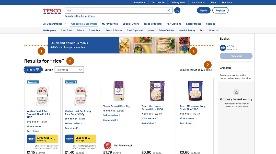
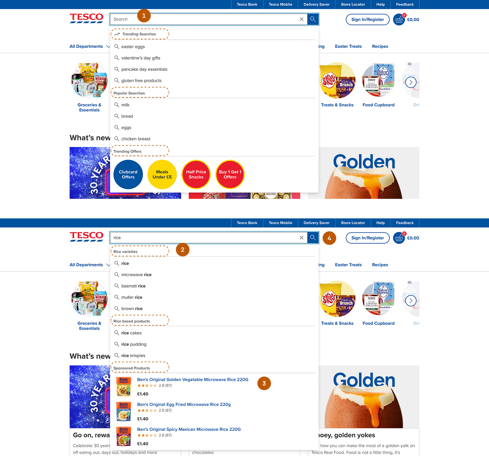
Zero Guidance:
When users interact with the search field, the interface offers no initial guidance—such as trending searches, popular items, or relevant categories. As they begin typing, suggestions appear but lack structure, mixing product types, brands, and related items.
This forces users to guess queries, rely on trial and error, and spend extra effort interpreting results—especially when unfamiliar products appear. As a result, cognitive load increases and decision-making slows down.
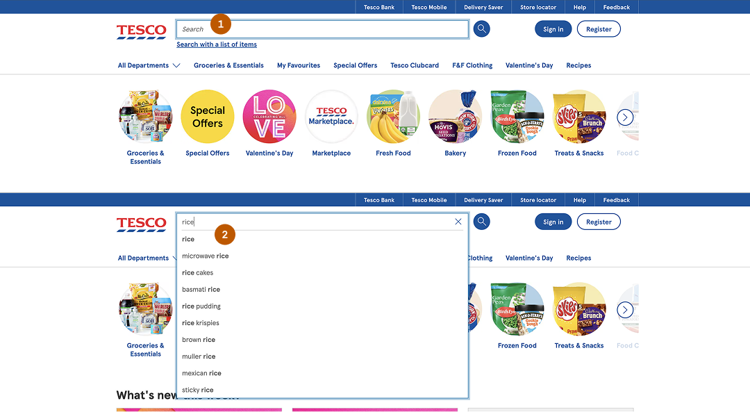
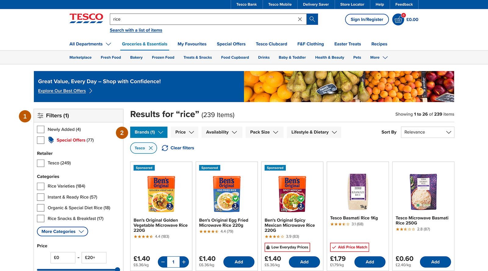
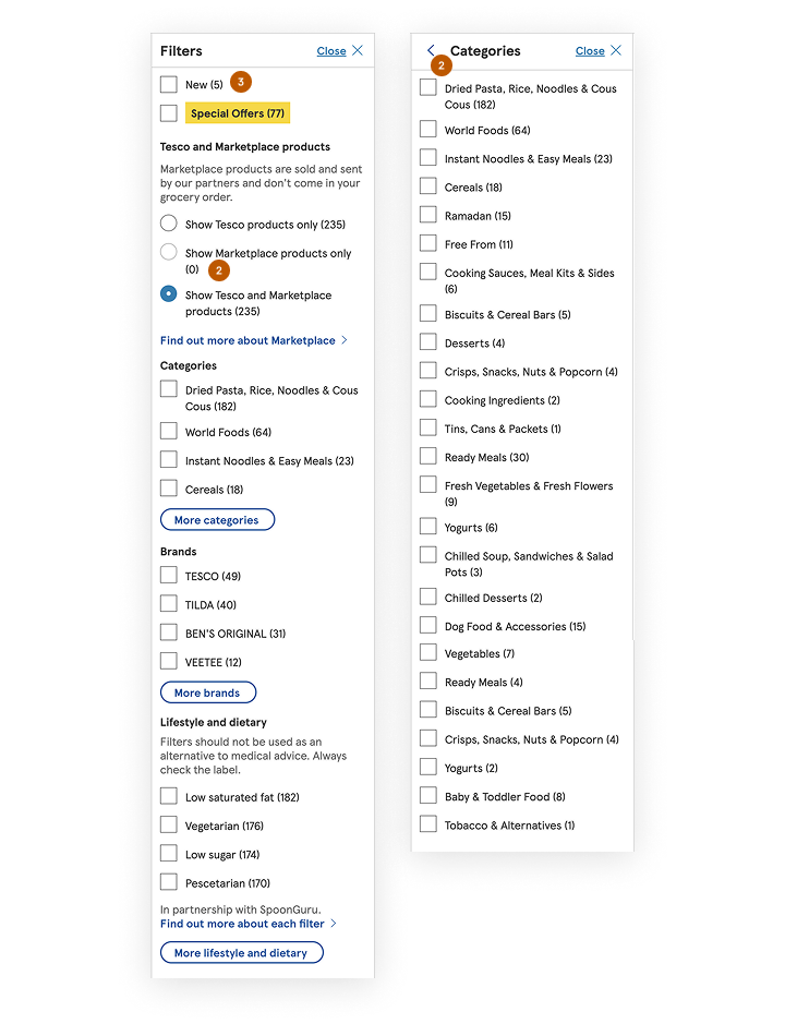
Hidden Filters Reduce Discoverability:
Filters are hidden behind a button and only appear after users click to open them.
This creates several usability issues: filters are not immediately visible, the layout shifts when filters open, and users may overlook available filtering options.
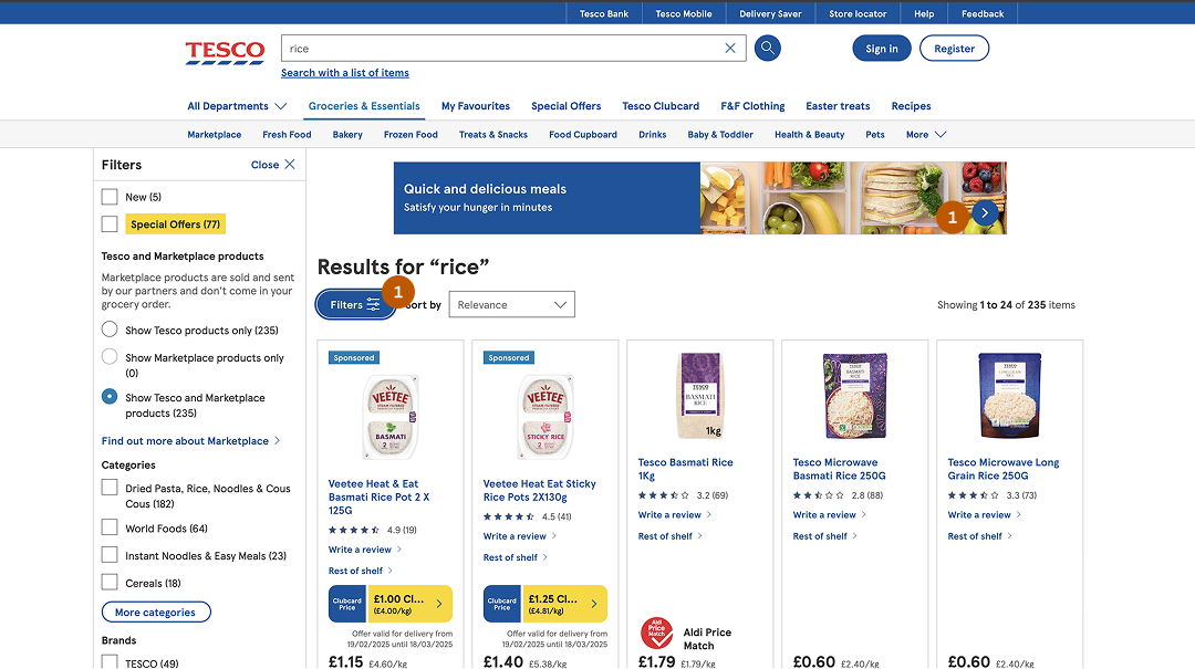
Irrelevant Filter Categories:
While searching for specific items such as “rice”, the filtering panel displays unrelated categories like: yogurt, vegetables and dog food.
These categories are not helpful for refining the search.
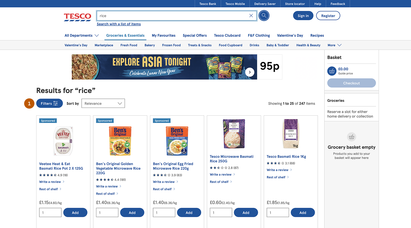
Cluttered Search Results:
The search results page contains elements that compete for user attention.
Examples include: promotional banners, unnecessary visual elements and inconsistent spacing in product cards. These distractions make it harder for users to quickly scan product results.
Why this matters?
In online grocery shopping, product discovery is a critical part of the user journey. Unlike physical stores where shoppers can browse aisles and visually scan for items, online platforms rely entirely on search and filtering to help users find products. When this experience is inefficient, users struggle to locate items quickly, leading to frustration and potential abandonment.
For Tesco, one of the largest grocery retailers, the effectiveness of product discovery directly impacts both customer satisfaction and business performance.
User Impact:
-
 High Cognitive Load: Without search suggestions or category guidance,
users must remember exact product names, which increases mental
effort.
High Cognitive Load: Without search suggestions or category guidance,
users must remember exact product names, which increases mental
effort.
-
Decision Fatigue: When search results lack clear organization, users must
sift through irrelevant products, making decision-making harder.
-
Wasted Time & Effort: Hidden filters and cluttered UI force users to take
unnecessary steps, slowing down their shopping process.
-
Unmet Expectations: Customers expect eCommerce search to function like
Google or Amazon. If Tesco falls short, users might switch to
competitors.
Business Impact:
-
 Reduced Conversions: If users can’t find what they need quickly, they are
more likely to leave without completing a purchase.
Reduced Conversions: If users can’t find what they need quickly, they are
more likely to leave without completing a purchase.
-
Decreased Customer Loyalty: A frustrating experience discourages repeat
visits, leading to lower retention rates.
-
Increased Support Costs: Poor navigation often results in more customer
service inquiries, increasing operational costs.
-
Negative Brand Perception: A difficult shopping experience can harm
Tesco’s reputation, making it harder to compete in the digital grocery
space.
Research & Insights
To understand the problem space and validate assumptions, I combined industry research, competitor analysis, and a heuristic evaluation of the existing experience.
Industry Benchmarking:
43% of users rely on search first and expect relevant suggestions. (Baymard Institute)
68% of users abandon a site when product discovery becomes difficult. (Forrester Research)
Poor filtering causes 20–30% of users to leave without purchasing. (Nielsen Norman Group)
Well-designed search experiences can increase conversions by up to 30%.
Competitor Analysis:
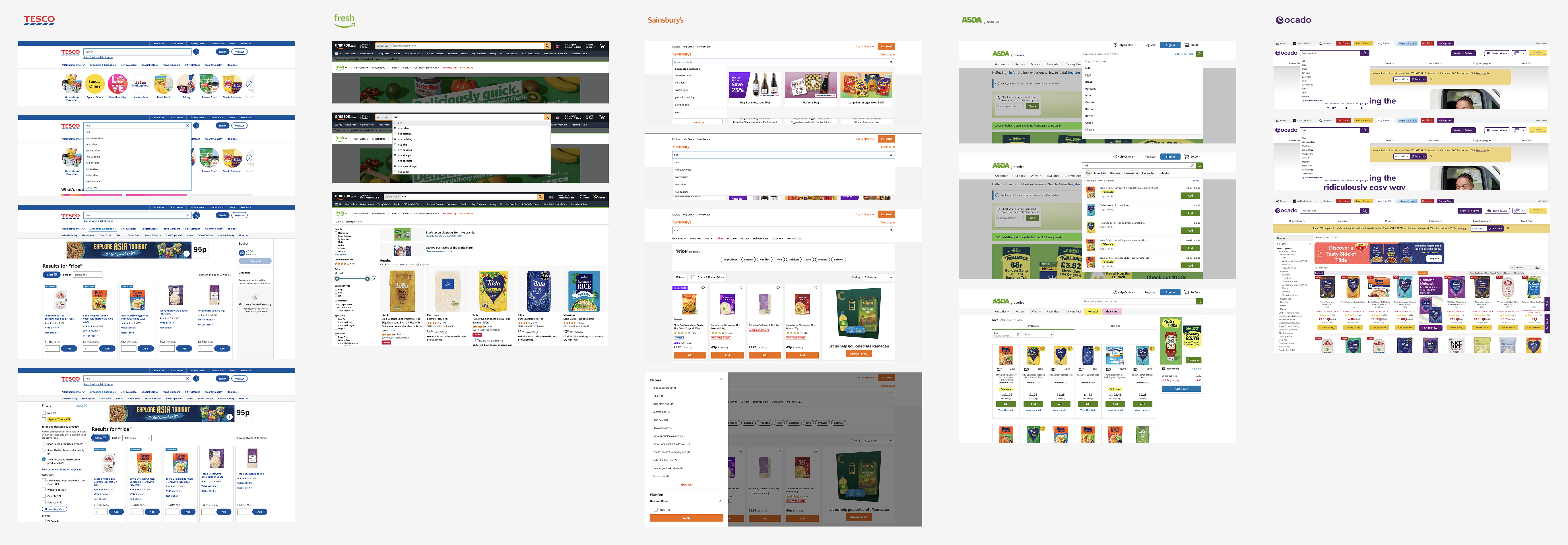
To identify best practices in search and filtering, I analyzed leading online grocery platforms and compared their experiences with Tesco. The goal was to understand how competitors support product discovery and where Tesco could improve.
The evaluation focused on four key areas: Search Suggestions, Filter Visibility & Relevance, Product Categorization & Results Page Clarity.
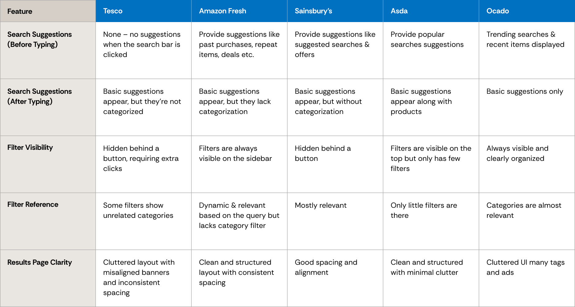
Customer Complaints & Online Reviews:
User discussions on forums and review platforms reveal recurring issues with Tesco’s search and filtering experience.
Navigation & Search Difficulties: Users on MoneySavingExpert forums reported challenges finding specific products and navigating search results.
Filtering Confusion: Some users mentioned that filters often display irrelevant categories, making it harder to refine searches.
Heuristic Evaluation
Using Nielsen Norman Group’s usability heuristics, several usability issues were identified in Tesco’s search and filtering experience.
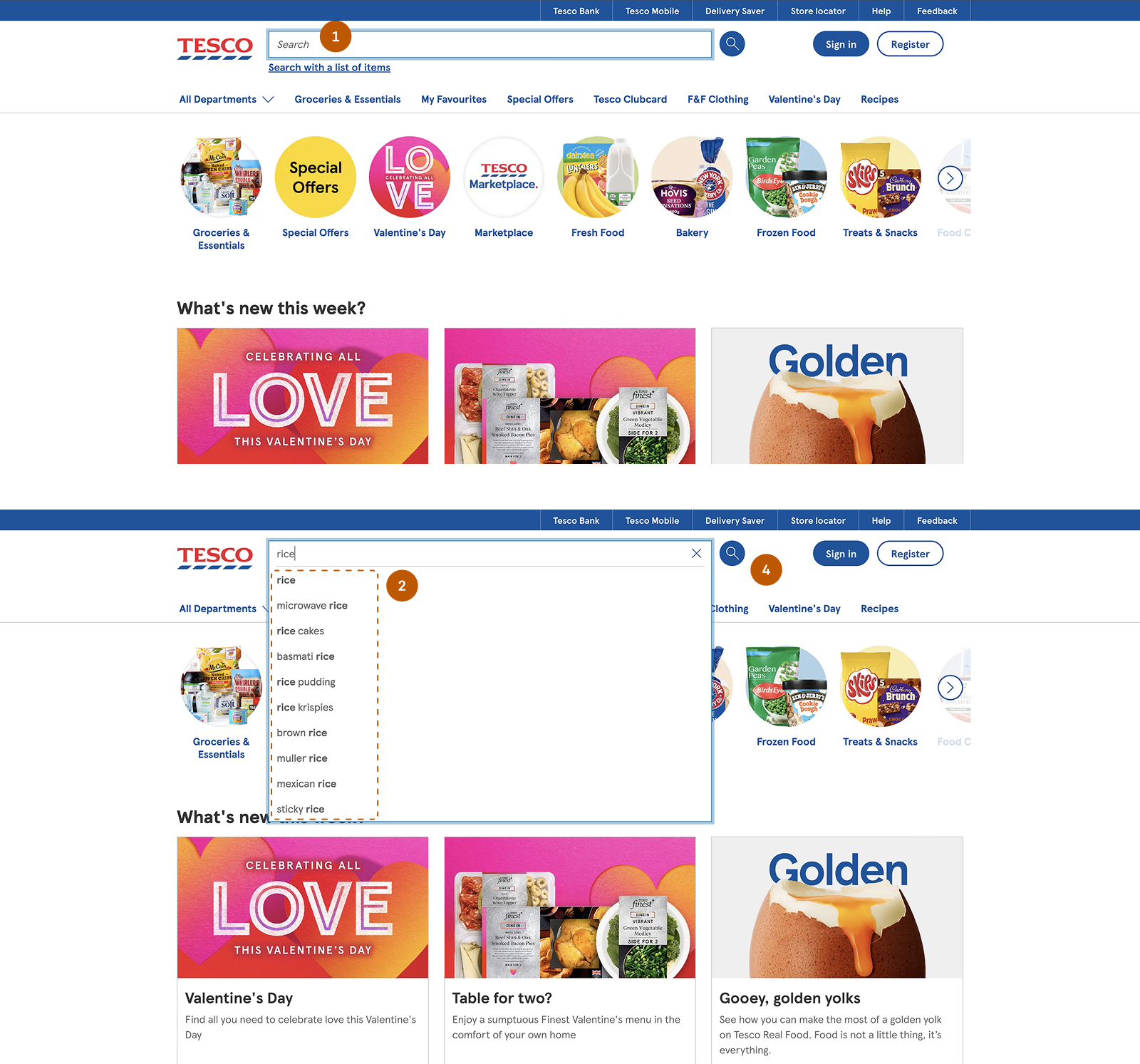
Visibility of System Status: The search bar provides no feedback while typing—no autocomplete suggestions, trending searches, or system responses.
Match Between System & the Real World: Search results mix different product types and related items, making results feel unstructured and harder to scan.
User Control & Freedom: Filters are hidden behind a button, requiring extra steps to access. Resetting or modifying filters is not straightforward.
Aesthetic & Minimalist Design: The results page appears cluttered due to banners, unnecessary UI elements, and inconsistent spacing in product cards.
Key Findings:
Shoppers struggle to find products efficiently because search and filtering lack clear guidance.
Users rely heavily on filters, but poor placement hides them behind unnecessary interactions.
Visual clutter in product cards increases cognitive load and slows decision-making.
Solution
I focused on three key goals to enhance Tesco’s product discovery experience:
Enhance Search Usability - Provide search suggestions and organize results logically.
Improve Filter Accessibility - Make filters visible and relevant to user queries.
Declutter the UI - Improve spacing, alignment, and content organization.
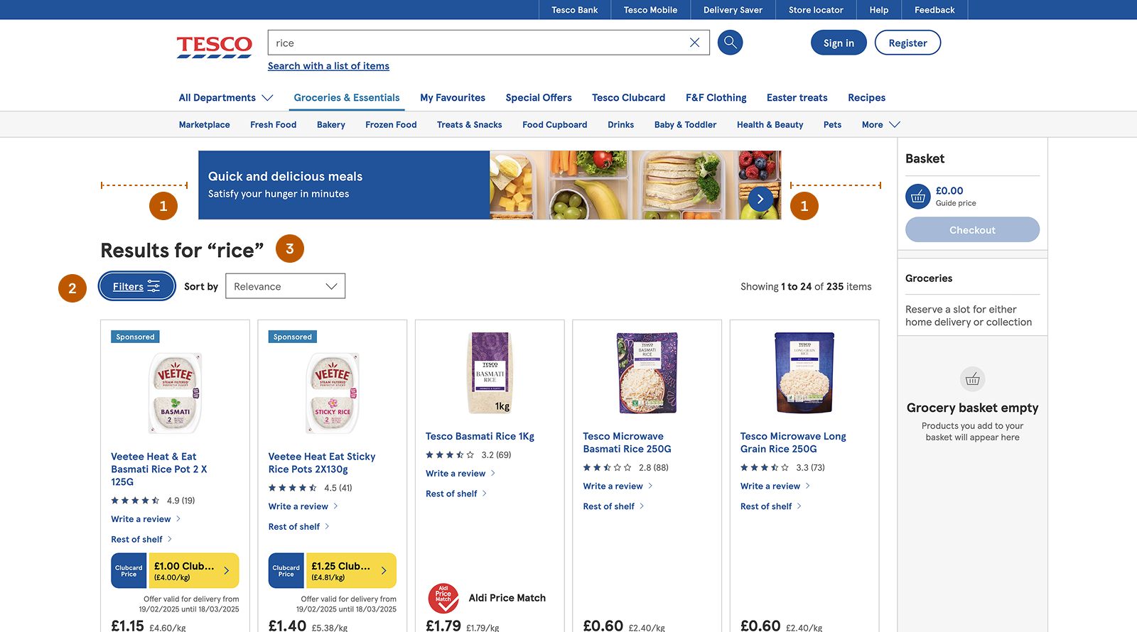
01. Guided Search
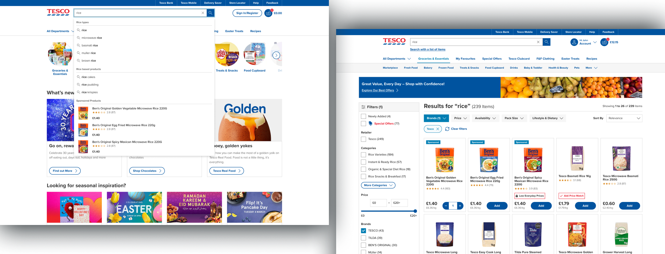
Search was redesigned to provide better guidance and reduce user effort during product discovery.
Introduced trending, popular, and contextual suggestions to help users get started
Categorized suggestions (e.g., for “rice”) to improve navigation and clarity
Highlighted featured products within search to surface relevant items faster
Moved the search icon inside the input field to reduce clutter and improve responsiveness
Improves search guidance, reduces cognitive load, and helps users find relevant products faster.
Before
After
Search - Before & After Screens
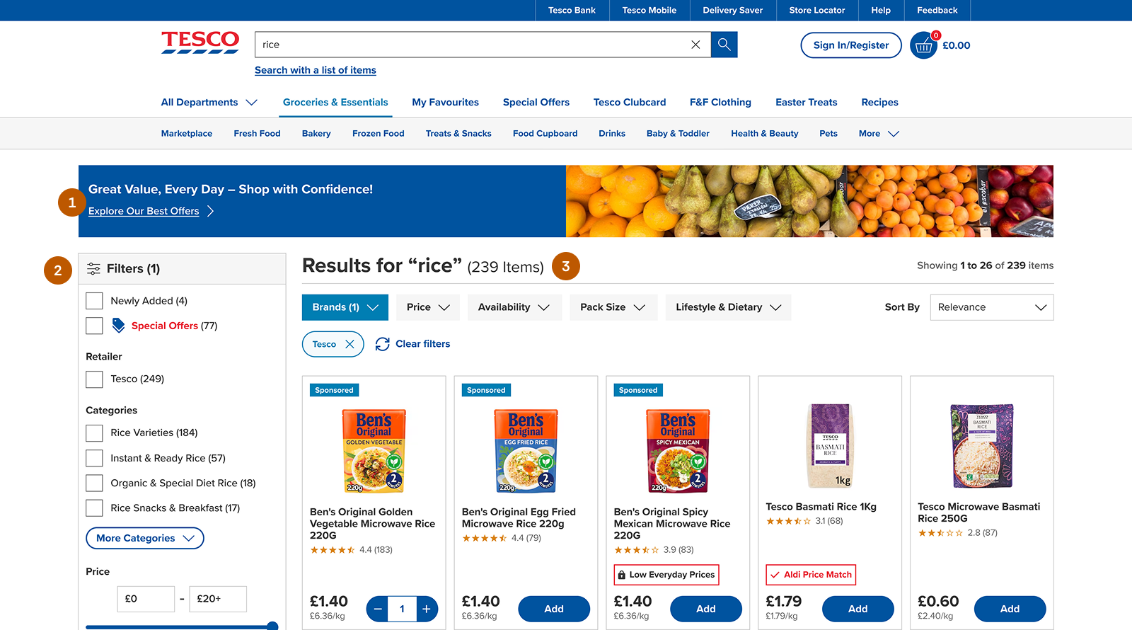
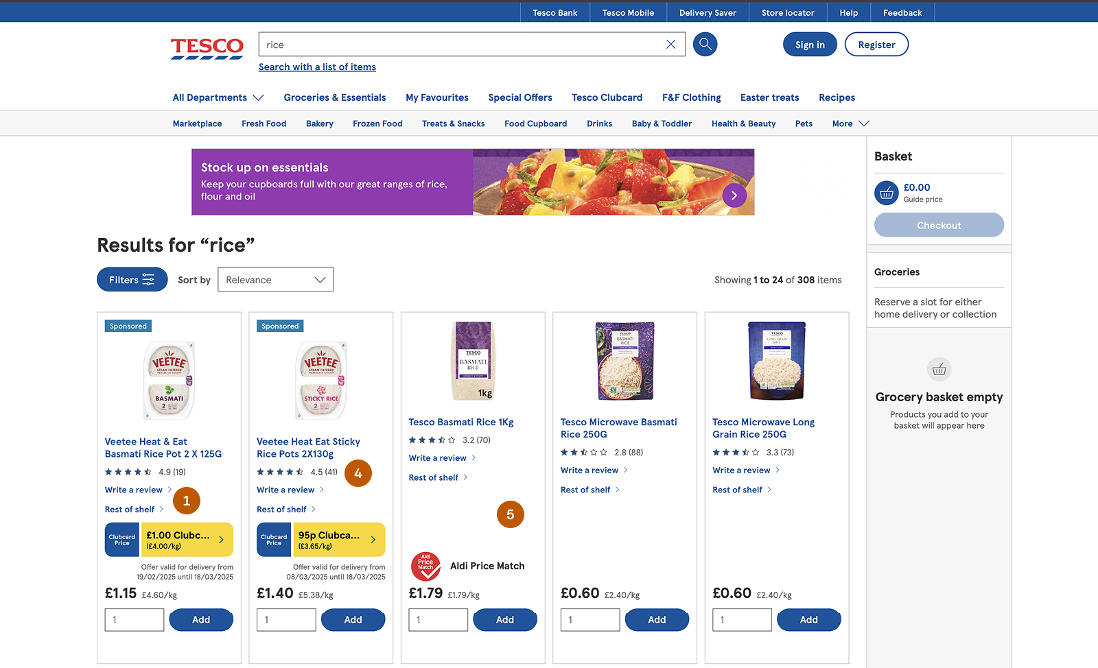
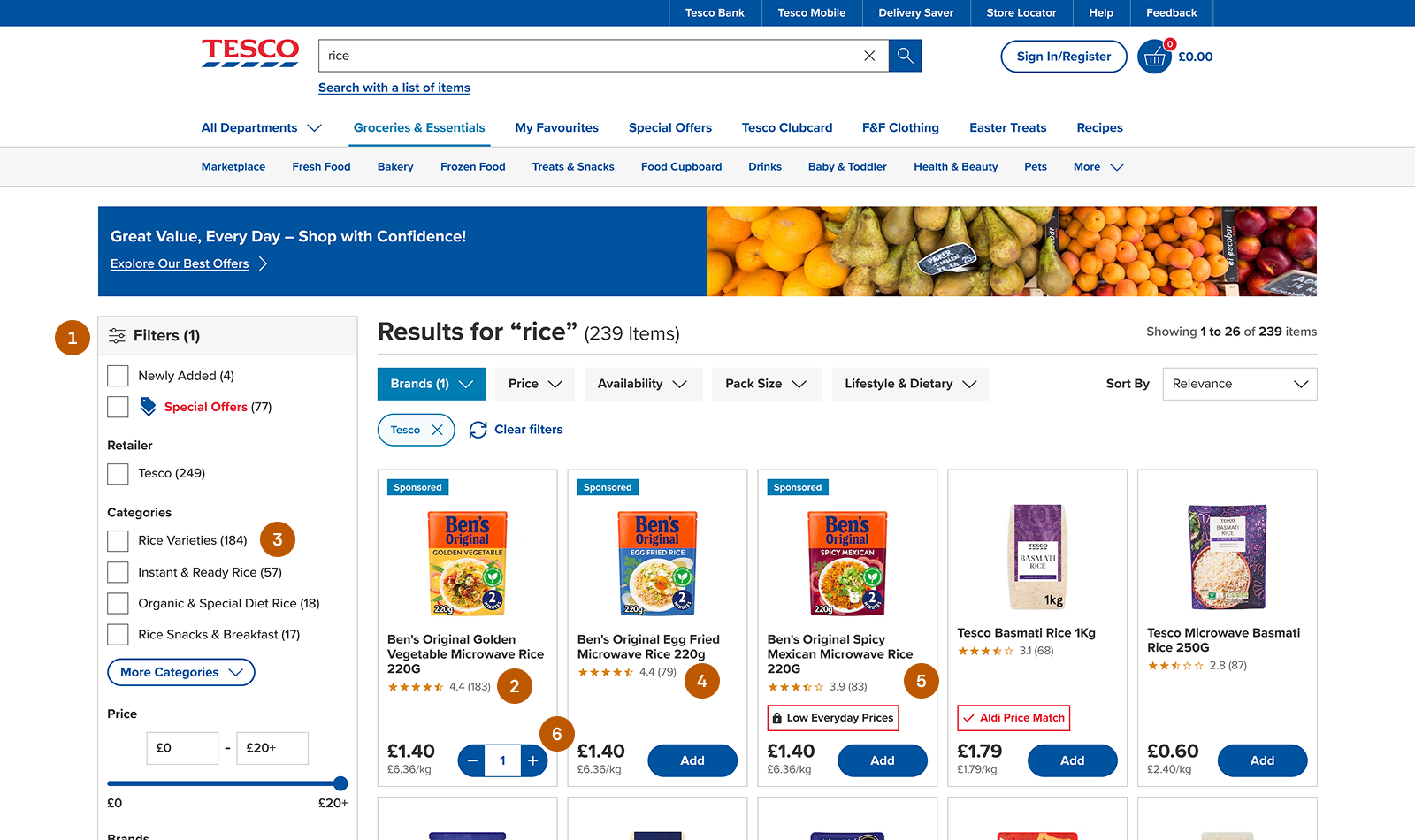
02. Search Results Page Enhancements
The search results page was redesigned to improve layout clarity and make product browsing easier.
Updated the banner to a full-width layout for a more seamless visual structure.
Repositioned filters below the banner to create a clearer content hierarchy.
Moved the result count next to the title for better visibility and faster scanning
Improves layout clarity and scannability, helping users quickly understand available results and refine their search more efficiently.
Before
After
Search Results - Before & After Screens
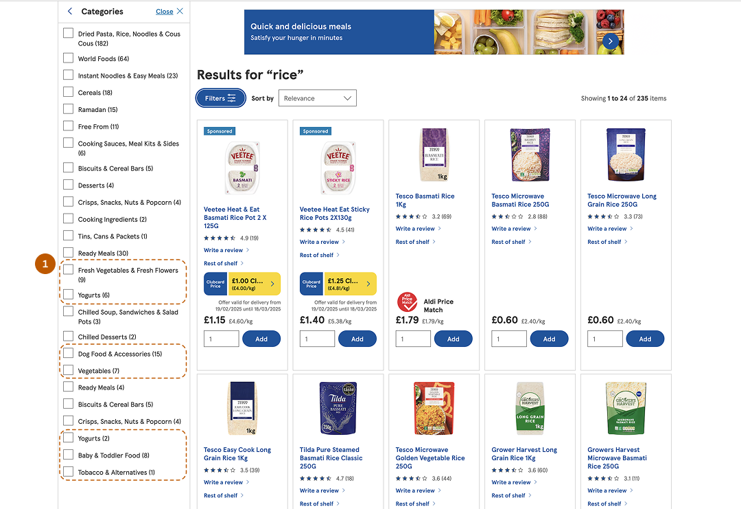
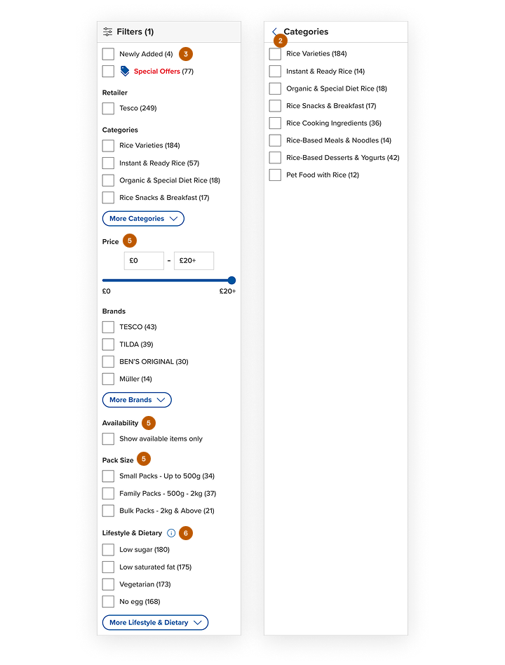
03. Filter Optimization
Filters were redesigned to improve visibility, relevance, and ease of use during product discovery.
Made filters visible by default, eliminating extra clicks.
Introduced top-level filters for quicker access.
Improved naming for clarity (e.g., “New” → “Newly Added”).
Removed irrelevant or empty filter categories.
Added useful filters like Price, Pack Size, and Availability.
Simplified layout by moving additional information into info icons.
Reduces interaction cost, improves discoverability, and enables faster and more confident filtering.
Before
After
Filters - Before & After Screens
Before
After
Category Filters - Before & After Screens
04. Product Card Refinements
Product cards were simplified to reduce clutter and improve usability during product selection.
Removed non-essential actions like “Add Your Review” and “Rest of Shelf” from the product card to reduce distractions.
Moved the review action to the product detail page, where it is more contextually relevant.
Replaced the “Rest of Shelf” functionality with more intuitive filtering (e.g., Rice Varieties).
Adjusted color usage to reduce overuse of the primary color and improve visual balance.
Refined spacing and alignment for a cleaner, more consistent layout.
Introduced an increment–decrement quantity selector that appears after clicking “Add,” saving space.
Reduces visual clutter, improves focus on primary actions, and makes product selection faster and more intuitive.
Before
After
Product Card - Before & After Screens
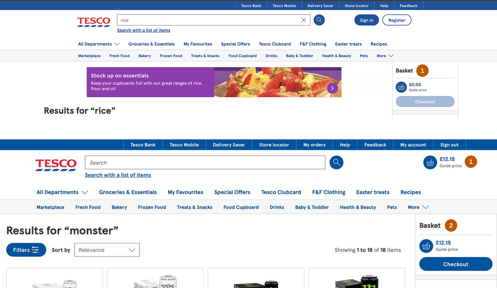
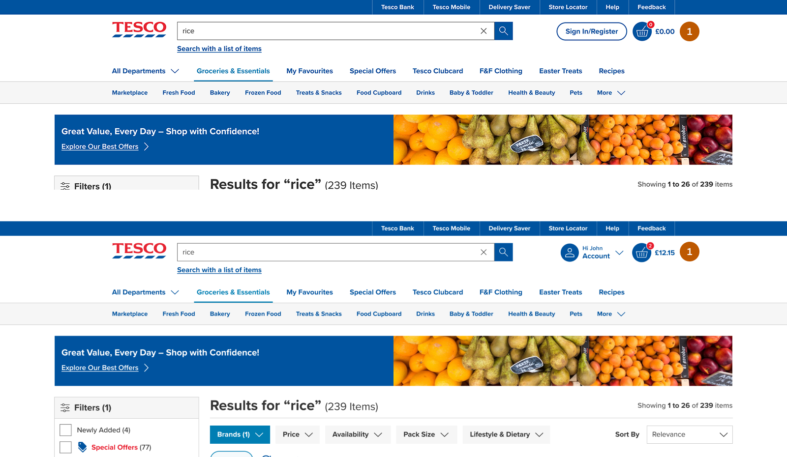
05. Cart Improvements
The cart experience was redesigned to improve consistency and better support user expectations.
Removed the floating cart, as it provided limited value for non-signed-in users and lacked space for a complete cart experience.
Moved the cart to the header to ensure consistency across user states.
Added a cart count indicator to give users immediate visibility of selected items.
Displayed a default count (“0”) to subtly encourage users to start adding products
Improves clarity and consistency, enhances visibility of cart status, and supports smoother progression toward checkout.
Before
After
Guest & Signed In - Before & After Screens
Impact
The redesigned experience improved product discovery and made product refinement significantly faster for users.
Abandoned Carts Recovered
Mobile Completions
Average Time
A/B Confidence
Note: Estimated impact based on usability insights and industry benchmarks.
Iterations & Lessons
Iterations
Early concepts focused mainly on guided search suggestions to support product discovery.
Further evaluation revealed that users also needed faster ways to refine results once browsing began.
The final design combined guided search with persistent filters to support both discovery and refinement.
Lessons
Discovery and refinement should be designed together in e-commerce search experiences.
Visible filters significantly reduce friction when users narrow down product results.
Simplifying product card layouts helps reduce cognitive load and speeds up decision-making.